

Merhaba,
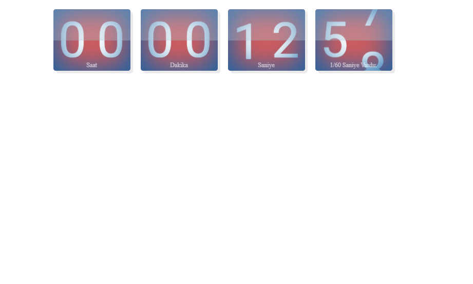
Genelde Saat Yapımında Java Script Kullanıldığını Gördüm Bunu Html Ve Css Kullanarak Klonlamayı Başardım Kodlar Aşağıdaki Gibidir ;
HTML Kodu :
CSS Kodu :
Saygılar Ve Sevgiler...
Genelde Saat Yapımında Java Script Kullanıldığını Gördüm Bunu Html Ve Css Kullanarak Klonlamayı Başardım Kodlar Aşağıdaki Gibidir ;
HTML Kodu :
HTML:
<head>
<link href='https://fonts.googleapis.com/css?family=Roboto:400,100' rel='stylesheet' type='text/css'>
<link rel="stylesheet" href="style.css">
</head>
<div class="box-counter-container">
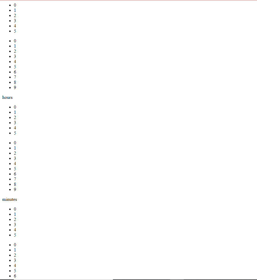
<div class="box-counter hours">
<ul class="ten">
<li>0</li>
<li>1</li>
<li>2</li>
<li>3</li>
<li>4</li>
<li>5</li>
</ul>
<ul class="unit">
<li>0</li>
<li>1</li>
<li>2</li>
<li>3</li>
<li>4</li>
<li>5</li>
<li>6</li>
<li>7</li>
<li>8</li>
<li>9</li>
</ul>
<label>Saat</label>
</div>
<div class="box-counter minutes">
<ul class="ten">
<li>0</li>
<li>1</li>
<li>2</li>
<li>3</li>
<li>4</li>
<li>5</li>
</ul>
<ul class="unit">
<li>0</li>
<li>1</li>
<li>2</li>
<li>3</li>
<li>4</li>
<li>5</li>
<li>6</li>
<li>7</li>
<li>8</li>
<li>9</li>
</ul>
<label>Dakika</label>
</div>
<div class="box-counter seconds">
<ul class="ten">
<li>0</li>
<li>1</li>
<li>2</li>
<li>3</li>
<li>4</li>
<li>5</li>
</ul>
<ul class="unit">
<li>0</li>
<li>1</li>
<li>2</li>
<li>3</li>
<li>4</li>
<li>5</li>
<li>6</li>
<li>7</li>
<li>8</li>
<li>9</li>
</ul>
<label>Saniye</label>
</div>
<div class="box-counter one-sixtieth-second">
<ul class="ten">
<li>0</li>
<li>1</li>
<li>2</li>
<li>3</li>
<li>4</li>
<li>5</li>
</ul>
<ul class="unit">
<li>0</li>
<li>1</li>
<li>2</li>
<li>3</li>
<li>4</li>
<li>5</li>
<li>6</li>
<li>7</li>
<li>8</li>
<li>9</li>
</ul>
<label>1/60 Saniye Vardır.</label>
</div>
</div>CSS Kodu :
CSS:
body { margin-top: 20px; }
 .box-counter-container {
  margin: 0 auto;
  text-align: center;
  width: 680px;
 }
 .box-counter {
  position: relative;
  float: left;
  margin: 0 10px;
  padding: 0;
  width: 150px;
  height: 120px;
  border-radius: 5px;
  background: #c93232;
  box-shadow: 5px 5px 0px rgba(0,0,0,0.08);
  overflow: hidden;
 }
 .box-counter:before {
  content: "";
  position: absolute;
  top: 0;
  left: 0;
  width: 100%;
  height: 100%;
  border-radius: 5px;
  background: rgba(255,255,255,0.2);
  box-shadow: inset 0px 0px 50px 10px #1364a7;
  z-index: 999;
 }
 .box-counter:after {
  content: "";
  position: absolute;
  top: 0;
  left: 0;
  width: 100%;
  height: 50%;
  border-radius: 5px 5px 0px 0px;
  background: rgba(255,255,255,0.2);
  box-shadow: inset 0px -50px 70px -50px rgba(100,150,180,0.35);
  border-bottom: 1px solid rgba(100,150,180,0.22);
  z-index: 1000;
 }
 .box-counter ul {
  padding: 0;
  margin: 0;
  list-style: none;
  position: absolute;
  top: 0;
  width: 50%;
  height: 100%;
  color: #FFF;
  text-align: center;
  line-height: 120px;
  font-family: Roboto;
  font-size: 6em;
  text-shadow: 0px 0px 2px rgba(255,255,255,1), 2px 2px 0px rgba(0,0,0,0.08);
 }
 .unit { right: 0; }
 .ten { left: 0; }
 .one-sixtieth-second .ten {
  -webkit-animation: ten 1s cubic-bezier(1, 0, 0, 1) infinite;
  -moz-animation:  ten 1s cubic-bezier(1, 0, 0, 1) infinite;
  -o-animation:   ten 1s cubic-bezier(1, 0, 0, 1) infinite;
  animation:     ten 1s cubic-bezier(1, 0, 0, 1) infinite;
 }
 .one-sixtieth-second .unit {
  -webkit-animation: unit 0.6s linear infinite;
  -moz-animation:  unit 0.6s linear infinite;
  -o-animation:   unit 0.6s linear infinite;
  animation:     unit 0.6s linear infinite;
 }
 .seconds .ten {
  -webkit-animation: ten 60s cubic-bezier(1, 0, 0, 1) 4.5s infinite;
  -moz-animation:  ten 60s cubic-bezier(1, 0, 0, 1) 4.5s infinite;
  -o-animation:   ten 60s cubic-bezier(1, 0, 0, 1) 4.5s infinite;
  animation:     ten 60s cubic-bezier(1, 0, 0, 1) 4.5s infinite;
 }
 .seconds .unit {
  -webkit-animation: unit 10s cubic-bezier(1, 0, 0, 1) infinite;
  -moz-animation:  unit 10s cubic-bezier(1, 0, 0, 1) infinite;
  -o-animation:   unit 10s cubic-bezier(1, 0, 0, 1) infinite;
  animation:     unit 10s cubic-bezier(1, 0, 0, 1) infinite;
 }
 .minutes .ten {
  -webkit-animation: ten 3600s cubic-bezier(1, 0, 0, 1) infinite;
  -moz-animation:  ten 3600s cubic-bezier(1, 0, 0, 1) infinite;
  -o-animation:   ten 3600s cubic-bezier(1, 0, 0, 1) infinite;
  animation:     ten 3600s cubic-bezier(1, 0, 0, 1) infinite;
 }
 .minutes .unit {
  -webkit-animation: unit 600s cubic-bezier(1, 0, 0, 1) 30s infinite;
  -moz-animation:  unit 600s cubic-bezier(1, 0, 0, 1) 30s infinite;
  -o-animation:   unit 600s cubic-bezier(1, 0, 0, 1) 30s infinite;
  animation:     unit 600s cubic-bezier(1, 0, 0, 1) 30s infinite;
 }
 .hours .ten {
  -webkit-animation: ten 216000s cubic-bezier(1, 0, 0, 1) infinite;
  -moz-animation:  ten 216000s cubic-bezier(1, 0, 0, 1) infinite;
  -o-animation:   ten 216000s cubic-bezier(1, 0, 0, 1) infinite;
  animation:     ten 216000s cubic-bezier(1, 0, 0, 1) infinite;
 }
 .hours .unit {
  -webkit-animation: unit 36000s cubic-bezier(1, 0, 0, 1) 30s infinite;
  -moz-animation:  unit 36000s cubic-bezier(1, 0, 0, 1) 30s infinite;
  -o-animation:   unit 36000s cubic-bezier(1, 0, 0, 1) 30s infinite;
  animation:     unit 36000s cubic-bezier(1, 0, 0, 1) 30s infinite;
 }
 @-webkit-keyframes unit {
  10% { transform: translateY(-120px); }
  20% { transform: translateY(-240px); }
  30% { transform: translateY(-360px); }
  40% { transform: translateY(-480px); }
  50% { transform: translateY(-600px); }
  60% { transform: translateY(-720px); }
  70% { transform: translateY(-840px); }
  80% { transform: translateY(-960px); }
  90% { transform: translateY(-1080px); }
  100% { transform: translateY(-1200px); }
 }
 @-moz-keyframes  unit {
  10% { -moz-transform: translateY(-120px); }
  20% { -moz-transform: translateY(-240px); }
  30% { -moz-transform: translateY(-360px); }
  40% { -moz-transform: translateY(-480px); }
  50% { -moz-transform: translateY(-600px); }
  60% { -moz-transform: translateY(-720px); }
  70% { -moz-transform: translateY(-840px); }
  80% { -moz-transform: translateY(-960px); }
  90% { -moz-transform: translateY(-1080px); }
  100% { -moz-transform: translateY(-1200px); }
 }
 @-o-keyframes   unit {
  10% { -o-transform: translateY(-120px); }
  20% { -o-transform: translateY(-240px); }
  30% { -o-transform: translateY(-360px); }
  40% { -o-transform: translateY(-480px); }
  50% { -o-transform: translateY(-600px); }
  60% { -o-transform: translateY(-720px); }
  70% { -o-transform: translateY(-840px); }
  80% { -o-transform: translateY(-960px); }
  90% { -o-transform: translateY(-1080px); }
  100% { -o-transform: translateY(-1200px); }
 }
 @keyframes     unit {
  10% { transform: translateY(-120px); }
  20% { transform: translateY(-240px); }
  30% { transform: translateY(-360px); }
  40% { transform: translateY(-480px); }
  50% { transform: translateY(-600px); }
  60% { transform: translateY(-720px); }
  70% { transform: translateY(-840px); }
  80% { transform: translateY(-960px); }
  90% { transform: translateY(-1080px); }
  100% { transform: translateY(-1200px); }
 }
 @-webkit-keyframes ten {
  16.666% { -webkit-transform: translateY(-120px); }
  33.333% { -webkit-transform: translateY(-240px); }
  50% { -webkit-transform: translateY(-360px); }
  66.666% { -webkit-transform: translateY(-480px); }
  83.333% { -webkit-transform: translateY(-600px); }
  100% { -webkit-transform: translateY(-720px); }
 }
 @-moz-keyframes  ten {
  16.666% { -webkit-transform: translateY(-120px); }
  33.333% { -webkit-transform: translateY(-240px); }
  50% { -webkit-transform: translateY(-360px); }
  66.666% { -webkit-transform: translateY(-480px); }
  83.333% { -webkit-transform: translateY(-600px); }
  100% { -webkit-transform: translateY(-720px); }
 }
 @-o-keyframes   ten {
  16.666% { -webkit-transform: translateY(-120px); }
  33.333% { -webkit-transform: translateY(-240px); }
  50% { -webkit-transform: translateY(-360px); }
  66.666% { -webkit-transform: translateY(-480px); }
  83.333% { -webkit-transform: translateY(-600px); }
  100% { -webkit-transform: translateY(-720px); }
 }
 @keyframes     ten {
  16.666% { -webkit-transform: translateY(-120px); }
  33.333% { -webkit-transform: translateY(-240px); }
  50% { -webkit-transform: translateY(-360px); }
  66.666% { -webkit-transform: translateY(-480px); }
  83.333% { -webkit-transform: translateY(-600px); }
  100% { -webkit-transform: translateY(-720px); }
 }
 label {
  position: absolute;
  bottom: 3px;
  left: 0;
  margin: 0;
  padding: 0;
  width: 150px;
  font-size: 75%;
  color: rgba(255,255,255,0.6);
  text-shadow: 0px 0px 10px rgba(120,170,200,0.5);
  z-index: 1001; [/B][/I][/SIZE][/FONT]
[B][I][FONT=courier new][SIZE=4] }
Saygılar Ve Sevgiler...