
- 3 Ara 2020
- 94
- 51
Herkese Merhabalar;
Bugün sizler için HTML CSS Vurgulu Üzerinde Neon Işık Düğmesi tasarımı yaptım kodlarına aşağıdan ulaşabilirsiniz.
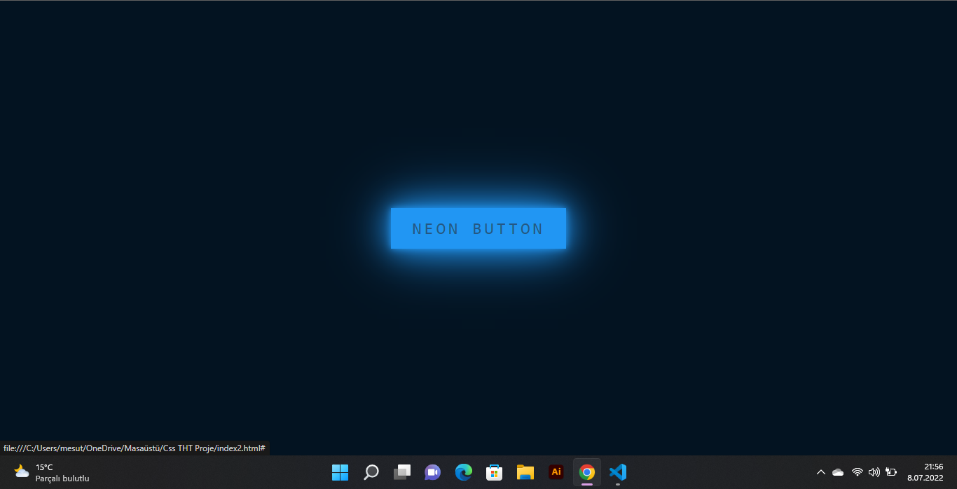
Soru ve görüşleriniz için yazabilirsiniz.
İyi Forumlar Dilerim.
HTML:
<!DOCTYPE html>
<html lang="en">
<head>
    <title>TurkHack Team | Cinco</title>
    <link rel="stylesheet" type="text/css" href="style2.css">
</head>
<body>
    <a href="#">
        <span></span>
        <span></span>
        <span></span>
        <span></span>
        Neon Button
        </a>
    </body>
</html>
CSS:
body
{
    margin: 0;
    padding: 0;
    display: flex;
    justify-content: center;
    align-items: center;
    min-height: 100vh;
    background: #031321;
    font-family: consolas;
}

a
{
    position: relative;
    display: inline-block;
    padding: 15px 30px;
    color: #2196f3;
    text-transform: uppercase;
    letter-spacing: 4px;
    text-decoration: none;
    font-size: 24px;
    overflow: hidden;
    transition: 0.2s;
}

a:hover
{
    color: #255784;
    background: #2196f3;
    box-shadow: 0 0 10px #2196f3, 0 0 40px #2196f3, 0 0 80px #2196f3;
    transition-delay: 1s;
}

a span
{
    position: absolute;
    display: block;
}

a span:nth-child(1)
{
    top: 0;
    left: -100%;
    width: 100%;
    height: 2px;
    background: linear-gradient(90deg,transparent,#2196f3);
}

a:hover span:nth-child(1)
{
    left: 100%;
    transition: 1s;

}

a span:nth-child(3)
{
    bottom: 0;
    right: -100%;
    width: 100%;
    height: 2px;
    background: linear-gradient(270deg,transparent,#2196f3);
}

a:hover span:nth-child(3)
{
    right: 100%;
    transition: 1s;
    transition-delay: 0.5s;
}

a span:nth-child(2)
{
    top: -100%;
    right: 0;
    width: 2px;
    height: 100%;
    background: linear-gradient(180deg,transparent,#2196f3);
}

a:hover span:nth-child(2)
{
    top: 100%;
    transition: 1s;
    transition-delay: 0.25s;
}

a span:nth-child(4)
{
    bottom: -100%;
    left: 0;
    width: 2px;
    height: 100%;
    background: linear-gradient(360deg,transparent,#2196f3);
}

a:hover span:nth-child(4)
{
    bottom: 100%;
    transition: 1s;
    transition-delay: 0.75s;
}
Soru ve görüşleriniz için yazabilirsiniz.
İyi Forumlar Dilerim.
